
The Town of Huntsville’s potential new brand speaks to the town’s “history, a deep connection to the natural environment, a sense of pride in having been influential in the creation of Muskoka,” according to the logo’s developer TWG Communications.
The new brand, which was approved during the town’s July 25 General Committee meeting but still needs to be ratified by council, will be used on wayfinding signage, for tourism material, economic development and investment attraction and retention.
William Ferguson and Cameron Wilcox represented the brand development group during the meeting.
“It was clear the brand must convey a sense of place for the Town of Huntsville, both past and present, while also presenting a bold, vibrant, contemporary looking feel that communicates Huntsville is a progressive, forward-looking, inclusive, warm, and welcoming community,” Ferguson explained, pointing out that survey responses from residents and businesses helped push the logo design process forward.
A total of 305 community members responded to the survey, while 23 stakeholders, like the Huntsville Business Improvement Area, Chamber of Commerce, and council, responded to a separate survey. “Feedback and input from both surveys was constructive,” Ferguson says.
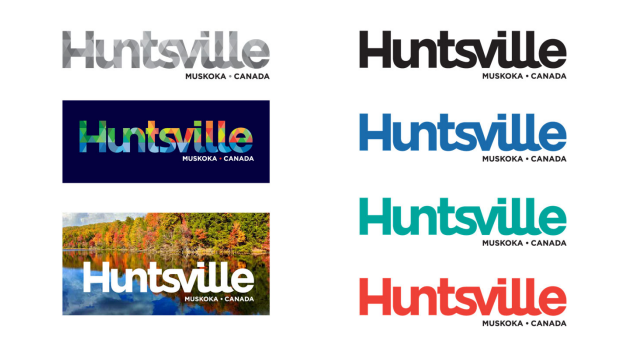
“The colours chosen represent the natural beauty of the landscape,” Ferguson explained. “The diamond background treatment with the font adds for depth and texture and offers a sense of movement and progression. The diamond grid is inspired by the details of Huntsville’s iconic Swing Bridge with its prominent diamond railings and truss.”
According to Ferguson, the font used for the new logo is unique to Huntsville.
Ferguson continued explaining that the “natural elements” of water, forests, and the four seasons had to be visible as well. “We heard through community engagement that history and culture were important and stakeholders said they wanted this to be authentic, progressive, modern, clean, simple, and vibrant,” Ferguson said.
Coun. Tim Withey asked why imagery wasn’t used for the logo.
Ferguson responded saying images can be used and changed depending on what material the logo is being utilized for. “I think that’s the hallmark of all of the neighbouring communities’ brands,” he said. “It’s a bridge, it’s a clocktower, it’s a rock, it’s a tree and if we went right up through the north and down to the south you would see them everywhere.”
Withey argued that having “something iconic” would make the logo stand out, but Ferguson said the way the logo is presented looks “cleaner and contemporary.”
Despite the lack of imagery, Withey said the new logo is an improvement over the previous one.
His fellow committee members agreed.
While Coun. Bob Stone, Brian Thompson, Jonathan Wiebe, and Deputy Mayor Nancy Alcock said they had to sit with the logo for some time, they agreed it does look good. “I think it’s really great,” Wiebe said.
Coun. Dan Armour liked the uniqueness of it and joked he looks forward to seeing it on a black t-shirt.
While community consultation was done during the design phase of the logo, Stone said he wants to show this logo off before it goes before council on Aug. 22. He said council needs to have “80 percent” of the public behind this.
Mayor Karin Terziano agreed, but Ferguson said that he didn’t think more community consultation is necessary. “At the end of the day, the work that has been concluded here is a result of the consultation that’s already taken place,” he said but added that it’s up to council if they do want to get more public feedback.
“Some people will be very vocal in favour, or against, that is typically the way with these things,” Ferguson said.